How to use the application
Filters
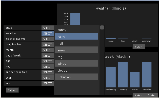
Filters can be found on the left of the screen, they can be used to filter the data that are represented in the barchart, in the scatterplot and in the map.
Filter types:
Filter types:
- State
- Weather
- Alcohol
- Speed
- Type of vehicle
- Age
- Sex
- Hour of Day
- Day of week
- Month of year
Bar Charts
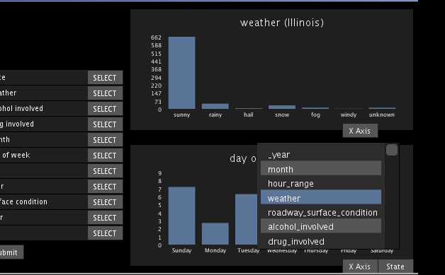
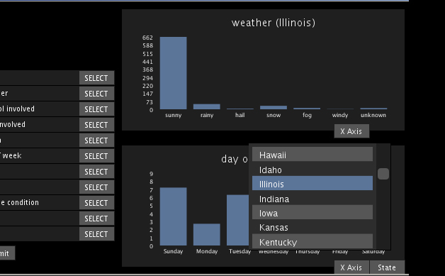
The bar charts can be used to see the impact of descrete variables on the number of crashes.
Each barchart can have a different variable on the x axis and it can filter by a different state, to make comparisons between states and variables easier.
Each barchart can have a different variable on the x axis and it can filter by a different state, to make comparisons between states and variables easier.
- The X Axis button can be used to change the variable represented on the x axis
- The value of the y axis represents the number of crashes for the selected filter
- It is possible to see the percapita data by clicking on the "per capita" button
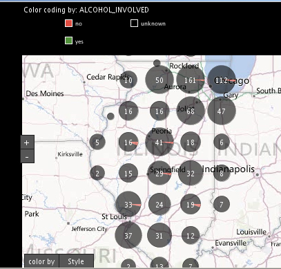
Map
- It is possible to easily drag the map using the mouse
- To zoom in/out, just use the +/- buttons or double click on the map in a particular location
- To switch the provider of the map, just click on the "asd" button
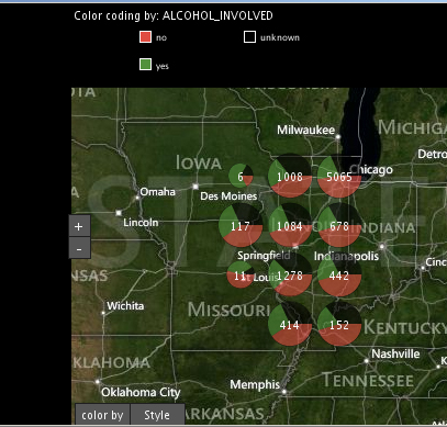
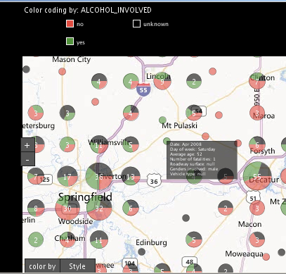
- If many crashes (points) are one near the other on the map, they will form a cluster with a piechart, zooming out/in will cause clusters to form/break up
- Clicking on a single crash will make a popup show up, the popup contains interesting informations of the crash, to hide the popup just click again on the event
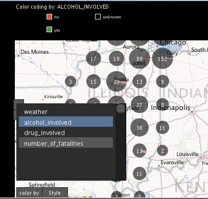
- To change the color just click on "color by" button
A general view of Illinois
Changing the color-coding
Clusters breaking and details of a single crash
Hybrid provider